A good booking system can be the backbone of your business; it can allow your guests to book activities without needing to contact you and use your valuable time.
But what can happen if your booking system doesn't look like it belongs on your website? Or if it redirects to an external system?
When this happens, your guests can lose confidence in the system and who has access to their information. In turn, this can lead to an increase in the number of incomplete bookings.
We're human and we make decisions on what we think is best. But in the case of EGNI, neither us nor EGNI themselves are the target market - parents were.
When it came to planning how the system would work, we had to research and involve parents to ensure it looked authentic, was simple, and done exactly what was needed and expected.
- Mathew, founder of Roseblade Media
So, how can you increase the confidence in your booking system? One simple way is to make it look like it belongs on your site.
Let's look at one of our clients, EGNI, to see how we helped their booking system look like it belongs.
1. Colour scheme

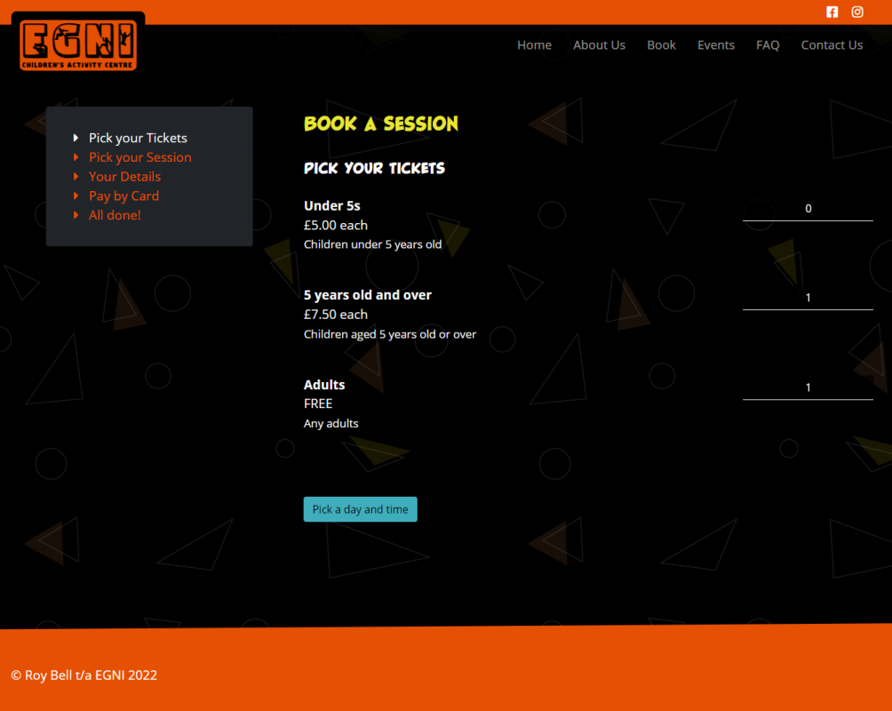
The booking system itself opens on the EGNI website and carries through the colour scheme of orange, yellow and blue.
It also has the same background pattern as the rest of the site, which is a good way to carry on the branding.
Both of these elements make it look like the system belongs on the website. If, for example, the background pattern wasn't there, or the colours had changed to red, purple and green, guests may think they have been redirected to a different site.
By keeping everything in line with the branding, you know where you are and that you can trust a booking has been made to the right place.
With increases in digital crime, including fraud and impersonation, it's important to keep as much inline as you can.
2. Make it easy to use

If you read our last blog post, you'll know that parents are strapped for time, so any booking system aimed at them needs to be quick and easy to use.
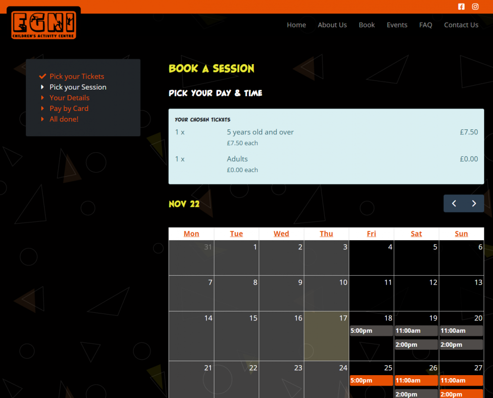
For example, have you considered having a calendar view on your booking system that allows users to easily see whether a date and time is available?
The easier the system is to use, the more bookings are likely to be completed using it. It's as simple as that.
The system we developed for EGNI is made up of 4 main sections, how many tickets you want to book, the date and time of the booking, your details, and finally, make your payment.
As far as we're concerned, it doesn't need to be any more complicated than that, although we appreciate sometimes other steps are needed, depending on your product or service.
3. Don't redirect to another site (if you can help it)
If you want your guests to trust you when they're making a booking, keep them on your site. It can be tempting to redirect them to a separate booking system site, but you're going to lose trust when doing it that way.
For example, would you trust making a booking on myawesomebookingsystem.com when you want to make a booking for myawesomeexperiences.com? Are you sure they're related sites?
They might have the same layout, colour scheme, and fonts, but who's saying they're the same business?
If you have a booking system on your website, simply have it as a page or section on your site. Try using something as simple as myawesomeexperiences.com/book or booking.myawesomeexperiences.com; it's simple and tells the user exactly what they can expect on the page.
It's good practice to drive and keep traffic on your own website, regardless of whether you take bookings or not (that's for another blog post!)
And there you have it
We've covered three simple tips that make it look like your booking system is meant to be on your website rather than being added on later.
Remember, if you need help Being Seen in the right way by your audience, reach out to us. We're more than happy to help you with your next booking system and website.


