When it comes to designing websites, it's easy creating a design that you like, and as long as you're happy with it, it doesn't matter whether you're using bright red coupled with bright blue. At the end of the day, as long as you're using your colour scheme, that's the main, but is it user-friendly? I doubt it is when put into practice. The red begins to become painful on the eyes of the user, and they quickly leave the site. This happens because you have designed your site around your branding and colour scheme rather than how a user would see it and the experience they would expect.
You can ask experts in web design to help you make your site more user-friendly, but in the end, they'll only be able to give you generic advice. To design for your users, you have to ask your users what they would like to see. They are the only ones who can advise you on what looks good and what doesn't.
So, How do I build a website for my visitors?
Unless you have experience building websites, you've probably looked through templates and come up with a design you like. Next, you chose your favourite colours (or the colours of the business) and thought it looked pretty good. Once you've got the basics in place, it's time to add images and content.
But at the end of the day, this may not be the look that your existing and potential customers are looking for. It may be so far from it that it puts them off. So, what do you need to look for and improve to ensure your website is attractive to your visitors?
You must ensure your website is easy to follow and navigate through. You also need to make sure that your visitors can easily find the information they are looking for. This means you need to understand how your clients will interact with your site. There are quite a few areas of websites that can be improved to help users, but a good place to start is with the understanding that generally, users don't like to click on much, so the fewer the clicks, the better.
A quick and simple way of understanding how a visitor would use your site is to put yourself in their shoes. Navigate around the site as they would and interact in ways they would. If you get stuck or the information is hard to find, you may need to consider a redesign.
How to see your site through the eyes of a visitor
This can be hard to achieve on your own. So, we've compiled three tips you can use to try and see your site how a visitor would.
1. The Blur Test
The blur test (often referred to as the squint test) is a design technique used to find what the eye is drawn to.
The idea is to look at a blurred version of the page to see what elements stand out. The elements that stand out the most should be related to the purpose of the page you are looking at. For example, if you want to be contacted, the contact details/contact form should stand out the most.
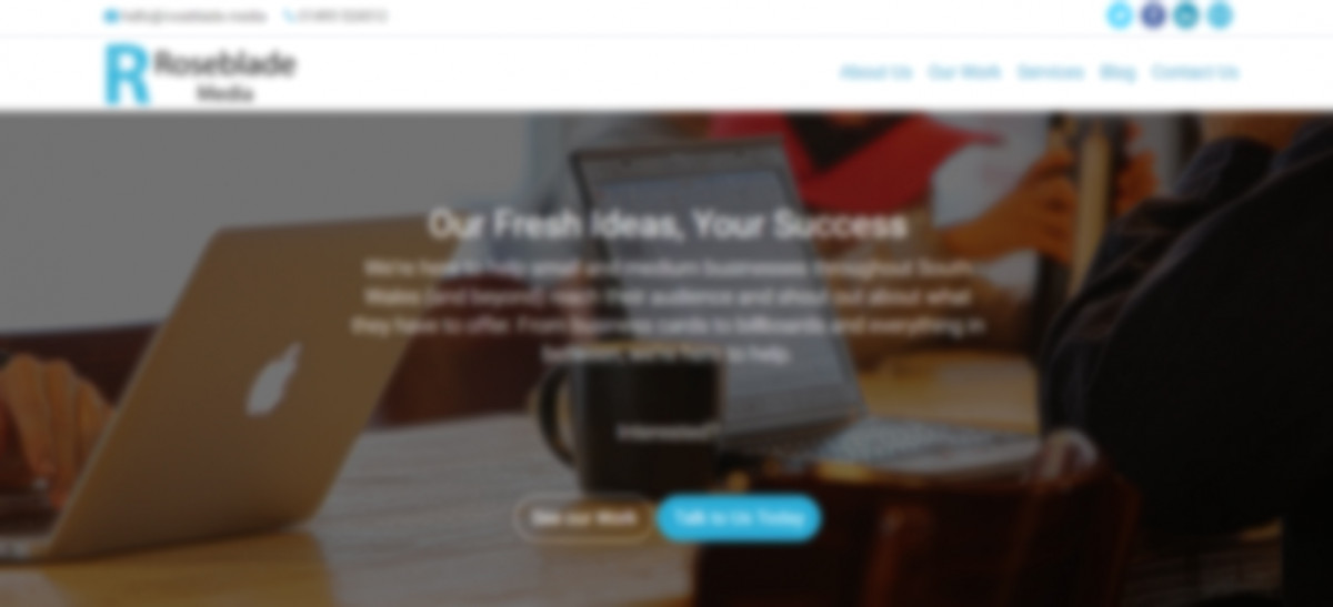
What do you think we want you to notice on this page? You're right if you think it's the blue button in the middle of the image. That blue button is the call to action for you to contact us. Also, you can still see the logo, so our brand identity is also getting through.
2. The Five-Second Test
A simple test in which you show a colleague/friend/family member an image of your website for five seconds and then hide the image. Then, ask them what they can remember from the website. This can help you understand whether any of the elements of your design stand out or whether you need to rethink anything.
Five seconds may not seem like long, but if you have a visitor browsing different sites trying to find the information they are looking for, they may move away from your website after this length of time. So make sure it's clear.
If you don't have anyone you can ask for this, then try fivesecondtest.com, which allows you to try it for free by showing it to other users and asking for their feedback.
3. Heuristic Testing
You'll need to find a few other people for this test.
The idea is to sit down and give everyone a few tasks to carry out on the website. This can be from navigating to a certain page to finding certain information.
They will then sit with you and direct you on where to click on the pages and what you should be doing.
This testing highlights how people may be thinking differently than you when it comes to design, as it's not likely anyone will use the same method as you.
To understand the findings of this test, you should also be asking why people are choosing to use the method they are.
Getting Feedback from Your Real Users
If you want to know how real users are using your site, you need to get their feedback. It can also be useful to know why visitors are leaving your site and whether you need to improve it in any way.
1. On-Page Survey
An on-page survey is a form that allows the user to submit brief answers about their experience.
However, a word of warning. Surveys like this can be seen as intrusive, so make sure you stick to the point. Find out if your website helped them and if they found what they were looking for.
2. Consider Using Live Chat
You've probably been on a website at some point where you've had a window pop up asking if you'd like help and that insert name is available to talk. This is live chat.
It allows you to interact with your customers and visitors and can also help you track what is causing problems with your site.
Using chat in this way will help you find out which pages are causing problems, any item descriptions that are not well enough explained and whether customers are dissatisfied with the service they have received.
Conclusion
Always think of your customer before yourself when it comes to design. The best-thought-out design for you may not be viable for most visitors to your site. Remember to gather feedback and even revisit the design of your site often, making little changes as you feel necessary.