There's a commonly held myth about websites that once they're designed and live, that's it. While this might have been true once upon a time, in the modern day, it couldn't be further from the truth.
Your website should be updated every so often so that it reflects both current trends in web design and what your audience would expect to see from someone in your industry. This doesn't mean you should be updating it every week as trends change, so don't panic. But it means checking in at least once a year to ensure your website looks its best.
So, what are our top 5 tips for improving the design of your website?
1. Keep it clean
When it comes to website design, it can be said that less is more.
You don't want your audience to load your site and be immediately bombarded with images and pop-ups, videos and animations, text and clashing colours. They won't know where to look.
While these elements alone can be eye-catching and lead your visitor to an important task or piece of information, using too many at once can be off-putting, and there's a higher chance that your visitor will leave before they've carried out the action you want them to.
To help prevent overload from happening, think "Does this add value to my website?":
- Does the pop-up capture relevant information, or does it get in the way of important information?
- Is the video relevant to the page content, or is it there to look pretty?
- Does the animation explain the concept, or is it confusing to someone not in the industry?
If the answer to any of these is "I want it there because I like it", you might have to re-think it; after all, you should be designing for your visitor's tastes, not your own.
2. Avoid clashing colour schemes
Another way of thinking of this is "I have to use my brand colours everywhere, even if they don't look good together".
While it's good to use your brand colours and ensure your audience can recognise you by them, it doesn't always translate well into website design.
Imagine a pale blue background with hot pink text over it. Would you be able to clearly see what the text is saying? Or would it be too much of a clash, and you wouldn't be able to make out anything on the page?
As a general rule of thumb, if your colour scheme involves any bright and eye-catching colours, you should include these in anything you want the user to interact with. For example, on our website, we use them in buttons and banners we want our visitors to notice. This way, they know it's something important that needs to be paid attention to.
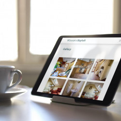
3. Spend time on your imagery
If you've not long started your business, or if you have a limited budget, then it can be good to start your website off with stock images. However, after a while, all stock images start to look the same, and your visitors will be able to tell you've used them.
If possible, you need to consider using your own images to give your visitors the sense that your business is real, and not something that's been thrown together overnight.
Whether you're using photos of the outside of your shop, or animations that show your processes, having images that directly relate to your business is a step in the right direction. At the end of the day, having fewer authentic images is better than having 15-20 stock images that any other business could use.
4. Have easy-to-understand content
It can be tempting to tell your visitors every bit of information you've accumulated since you started out in business. But stop to think - "Is this too much information? Do they really need to know every little detail?".
Why are you telling your visitors that clothing in the 1950s was made from a sturdier material than clothing in the 2010s when you're trying to sell them shoes today? It might be an interesting point, but is it something that your audience needs to know? And will it drive their purchasing decision?
Having technical, hard-to-read content can be off-putting for your website visitors.
So keep it clean and relevant to your business.
5. Have easy-to-read content
This point is easy to read, in the literal sense.
Going back to your colour scheme and clashing colours making text hard to read. Your website has been designed around a specific purpose; if your visitors can't read the text, are they going to be able to carry out this action?
When designing your website, keep the following three items in mind:
- Contrast - if there isn't enough of a colour difference between your text and the background, it's going to be a struggle to read it.
- Large lettering - if your text is too small, your visitors are going to be straining trying to read it. Unless they've already left your website because they can't read the content on it.
- Type of font - having a fancy font isn't always the best way to go. It might fit in with your style, or make you look interesting to your audience, but it can also make your content hard to read. Having a cursive, squiggly font doesn't tend to work well for large areas of text.
5. Keep your navigation in mind

Some of your website visitors might want to have a look around at the other things you do as a business. For example, if they're thinking of making a purchase, they might go to your "About Us" page to try and find out whether you're reputable, or they might have a look through any case studies that you've done to make sure you're producing work that's to their standard.
However, think of what will happen if your visitor can't easily navigate your site.
They might think you're not trustworthy and that you're trying to hide information. Or they might just get frustrated they can't find the information they're looking for and try to find it on one of your competitor's websites.
How can you improve the navigation on your website? Think like a visitor.
If you know your visitors well enough, you can think about the information they would be looking for and how they would typically expect to find it.
Make sure your menu items clearly say the pages they link to. If they're not clear enough, or you've tried to be too clever with the wording, it can be confusing, and your users can end up in unexpected places.
Still not sure?
Hopefully, these top tips have helped you when it comes to the design of your website. But if you're still unsure what to do, or how it should look, there's no harm in getting professional advice.
By hiring a professional web designer, you're not admitting defeat, quite the opposite. You're admitting that you need help bringing your website to life and making it the best that it can be.